Monday, August 14, 2017

Vince Low

We are going to look at Malaysian Artist Vince Low for several reasons...


First, Low is a great a capturing likeness and mood. He does this by focusing on the eyes on the face. They don't call them the windows to the soul for nothing. The eyes also can establish a system to measure by.


The Second reason we are going to look at Low is because of gesture. We want to create movement and energy in our work. So we are going to study Low's line work to embrace the energetic power of his drawings.


The third reason also involves gestural lines. Low's wild line work allows for the artist to make discoveries. These discoveries lead one down a visual path to success. When you find what works you darken the lines to emphasize out what is working. This is like singing that amazing note your voice hits a little louder so your audience can really appreciate you got it right.


Welcome!


Welcome students to Braden River Art's Blog!

In this blog you will be able to link to class assignments, find explanations of projects, gain access to reference materials, and advanced classes will be able to post assignments. I'm hoping this will further reflect the professional world and make your learning environment even better. 

Make sure you download and print a syllabus from…


Also, please check out our gallery site at

Monday, May 22, 2017

Exam Review


Finish Movie & Decorative projects...
Exam Review

Movie Poster Rubric

Completed Projects Should have the Following Elements

Completed Drawing Spray Fixed
Oil Wash
Gesso/Acrylic Finish

The following elements will be graded
  • Story (Is your image appropriate for the story?)
  • Composition
  • Value
  • Color 
  • Professionalism (Presentation, how clean the image is, well referenced etc..)
Decorative Rubric

  • Pattern
  • Repetition
  • Use of Shapes
  • Use of Lines
  • Contrast
  • Presentation

Friday, May 19, 2017

Intro to Decorative...


What is decorative illustration? Think music. Music uses repetition. There are patterns in songs. Every song has an intro... then think verse, chorus...verse...chorus...bridge...chorus. Some songs are slow and other songs are fast and energetic...this dictated by the rhythm and voice. 

Decorative illustration has patterns, repetition, and rhythm. Remember line is voice, and shapes are sounds. Find a theme to inspire you, and create visual music to it.

Nature has patterns that develop in it. Think of the veins of a leaf, or a snowflake. Nature is considered organic. Geometric Shapes are shapes not usually found in nature. They are inorganic shapes or consider mechanical because they are constructed by humans. Pyramids are not created naturally. Humans build them. The combination created above shows an interesting visual contrast.


Si Scott is a decorative illustrator and designer who takes the concept of line is voice to an amazing level. Scott's lines transform into elegant flourishes that swoosh and swirl in a ballet of ink and gesture.


In complete contrast to Si Scott the images above use more primitive lines. This means they are bold gestural strokes that louder and more uneven. However, these are still decorative images because of the patterns and repetition of shapes.


This brilliant decorative illustration uses contrast to bring attention to the face with using the black larger mirror to draw attention to the face. Then the hair is where the patterns begin, and the bees reinforce the hair pattern by their own contrasting yellow and black patterns. The focus of this piece is to be aesthetically pleasing. Notice this work of art is also still using the rule of thirds


The perfect ending of a song brings us full circle to reminding us of the sounds that keep us listening in the first place. So we finish with decorative musical illustrations by looking at gig posters.

Sunday, May 7, 2017

Movie Poster Color


C.F. Payne inspired this coloring technique that we are learning for this project.


A key part is once you develop the value fully we need to determine a color that can harmonize the whole picture. In the picture above, green was the mother color that all the other colors are blended with. That green is what helps harmonize the elements in the picture.


It doesn't matter what medium you use. Get the values correct and then picking a mother color is a good way begin your color process and establishing temperature and mood. Think of the mother color as the atmosphere.


This is an example of the process we are using as demonstrated by artist, Greg Newbold. He walks us through his process of creating an illustration of Clint Eastwood. I would like you to notice he always has his reference handy as you should too.


Every great illustration starts off with a solid value drawing. Without this, consider the bones of your creation faulty. So it is critical to have an amazing value drawing.


Newbold seals his drawing using acrylic paint. We are going to use Crystal Clear instead. The reason is mostly cost and ease as we are learning this multi-media process.


The next step is to add an oil rub. This is where you take an oil paint color that you are going to rub into the illustration board. Word of warning this is the scary part. If too much moisture has seeped into the board, the paint can absorb into the board which will destroy your drawing. However, if this step works miraculous things can happen to your picture! With great risk can come great reward. Hopefully, the crystal clear will do its job and the drawing will be sealed and the oil rub will look amazing.


Once you have rubbed off the excess oil with paper towel you are going to use an eraser to bring out the values even further. Cheaper paper towels work better than expensive ones. After you are done removing the oil for the values you need to let the board dry.


After the paint is dried you can start applying color pencil. This is where a color study becomes very important. You shouldn't apply color unless you know exactly what colors you are going to put down and tested in your study first. Accidents are hard to explain to a client and can be avoided through studies.


Once we have your color finished with the pencils we can apply gesso and acrylic paint to pop some highlights. It's important to never forget that this is a process, but the end result can be mind blowing.


Saturday, April 29, 2017

The Movie Project Process


Once you have your great reference we come to the dilemma of how much value to put on the picture. The reason this is a dilemma is because many young artists are afraid if you put the value on to strong that it will mess up the color.


But nothing could be further from the truth. You need good value to inform how you see the color. Without light you don't see color. However, with out darkness its difficult to tell what to focus on. Value adds contrast. It helps pop what you need to see. Value helps create focal points. Focal points are places the artist is trying to get the audience to pay attention to.


Norman Rockwell's The Runway is keyed in a light value range. The highest contrast is the boy. This makes the boy the main focal point. Compositionally, we would refer to the boy as the papa bear. Between the boy's high contrasting clothes and his head popping against the soda clerk's shoulder value wise allows the viewer to focus on him first. The police man is the next most important, but while he is darker he has less contrast.


Norman Rockwell's Freedom from Fear is another example of using strong values to get your desired result. This painting was originally painted by Rockwell as a reason why Americans should fight in World War 2 based upon President Franklin Delano Roosevelt's Four Freedom's.


The values are keyed very differently than the Runaway, these are much darker. The highest contrast is on the father as is the directed underlying message, "Father's go to war to protect their wives and children." Notice the father's bright shirt contrasting against the very dark background. This makes the father the focal point.


Stephen Spielberg, the famous movie director, was so impressed with Rockwell's The Freedom from Fear storytelling in this image he created an entire movie based upon this painting called Empire of the Sun.


He said their was more story telling in that one painting than most directors can cram into an entire movie. What he was talking about was Rockwell's brilliant use of focal points created by pushing the values like Mozart would push piano keys.


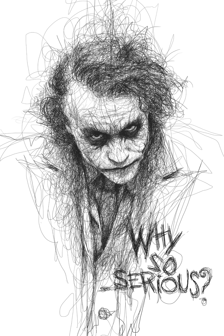
Here is a modern homage to the Freedom from Fear...


In your own work we will be stressing hitting the right value notes to push focal points.


Don't be afraid of value. Push it! Embrace it! Value first and then color. Your colors will be better for it.


Ok questions you need to answer about your work...

  1. What is the most important thing you are trying to emphasize in your poster?
  2. How are you using value to make this important element the focal point for the viewer?
  3. Is the contrast you are creating clarity or confusion?

Remember the easier your audience understands what you are trying to communicate the more likely they will appreciate it.


Monday, April 17, 2017

Due Dates!


Is due Friday April 21st!


Movie poster board check is on Monday...

April 24th.