
Monday, August 28, 2017
Sunday, August 27, 2017
We are going to begin a Special Project Inspired by Peter De Seve and Chris Ayers

We are learning how to appreciate form and story tell with it by exaggerating it through the art of caricature. In doing this, we'll be studying master illustrators and concept artists Peter DeSeve and Chris Ayers.

We will be learning the proper process for studying form so we can manipulate it.

Once you understand a form you'll have the ability to add a personality and punch up its expressions. Look at the study of a whale below by DeSeve.

Chris Ayers is also a master of form who also uses animals as a device for story telling.

A key technique is adding human characteristics to the animal forms being exaggerated. We know what exhaustion feels like, but what does it look like? How can we make our viewer feel that feeling too.

The more you can bring your personal experience into your work the more your audience will be able to relate to it, and

An important writing trick is to write what you know. Well no one can experience everything, but we can have similar feelings as almost anyone and exploring this can give us the power to convey almost anyone's story. We have to find our link so that we can convey that link to our audience.
Ask these questions:
Who am I trying to convey?
How do you think they feel about their lot in life?
Have I ever felt that way, and what did I look like when I did?
How do I make what they feel like more convincing to my audience?
Sunday, August 20, 2017
Introduction to Caricature
We are going to learn how to caricature!


Caricature is a very old art form that often uses exaggeration to tell a story. You can tell a whole story about someone through the stretching of their features. Also there is a very important point to why one would use caricature to tell a visual story. The most important reason is sometimes an impression can feel more real than the actual reality.

While the above image says its going to rain does it feel like rain?

Raining cats and dogs while an exaggeration feels more real.
What says hot more?

or this?

Look at this ice cream truck! That's heat!

We are going to use Mad Magazine Tom Richmond as a basis for our approach to caricature.
His website http://www.tomrichmond.com/ is a wonderful resource that you should refer to for assistance with this blog.
There are three key concepts that you have to understand to being successful with caricature:
Likeness- If you can’t tell who it is supposed to be, then it is not successful. All good caricatures incorporate a good likeness of their subjects.

This looks like Jay-Z. The image captures his attitude. He wears sunglasses like these.

This is a picture of Bob Ross. Bob Ross is a famous painting instructor who known for telling people to paint "Happy Little Trees."

This caricature is an exaggeration of his features but still are good representation of who Bob Ross is.

Again here is another exaggeration, but it still feels right. Does Ross have huge hair? Yes. Does he have a big beard? Yep.
Comedian George Carlin said it best that what is funny has to be true. So an exaggeration is different than a distortion. If you gave Ross short hair and no beard then it wouldn't feel right.
The foundation of what Art is...is that it's communication. So communicate something! Have an opinion. This establishes why what you say has meaning. When you repeat what is already said or known you are being a glorified copy machine or a parrot.

You are not a parrot, but a human being! Have an idea. Say something with your drawing.
Here are some very different pictures of Michael Jackson. Each are showing him in a different point of view depending on the view of the artists.


Monday, August 14, 2017
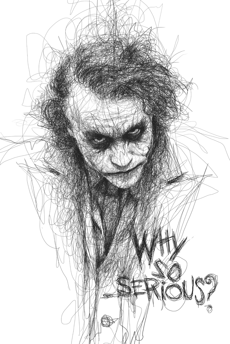
Vince Low
We are going to look at Malaysian Artist Vince Low for several reasons...

First, Low is a great a capturing likeness and mood. He does this by focusing on the eyes on the face. They don't call them the windows to the soul for nothing. The eyes also can establish a system to measure by.

The Second reason we are going to look at Low is because of gesture. We want to create movement and energy in our work. So we are going to study Low's line work to embrace the energetic power of his drawings.

The third reason also involves gestural lines. Low's wild line work allows for the artist to make discoveries. These discoveries lead one down a visual path to success. When you find what works you darken the lines to emphasize out what is working. This is like singing that amazing note your voice hits a little louder so your audience can really appreciate you got it right.


First, Low is a great a capturing likeness and mood. He does this by focusing on the eyes on the face. They don't call them the windows to the soul for nothing. The eyes also can establish a system to measure by.

The Second reason we are going to look at Low is because of gesture. We want to create movement and energy in our work. So we are going to study Low's line work to embrace the energetic power of his drawings.


Welcome!

Welcome students to Braden River Art's Blog!
In this blog you will be able to link to class assignments, find explanations of projects, gain access to reference materials, and advanced classes will be able to post assignments. I'm hoping this will further reflect the professional world and make your learning environment even better.
Make sure you download and print a syllabus from…
Also, please check out our gallery site at
Monday, May 22, 2017
Exam Review

Finish Movie & Decorative projects...
Exam Review
Movie Poster Rubric
Completed Projects Should have the Following Elements
Completed Drawing Spray Fixed
Oil Wash
Gesso/Acrylic Finish
The following elements will be graded
- Story (Is your image appropriate for the story?)
- Composition
- Value
- Color
- Professionalism (Presentation, how clean the image is, well referenced etc..)
Decorative Rubric
- Pattern
- Repetition
- Use of Shapes
- Use of Lines
- Contrast
- Presentation
Friday, May 19, 2017
Intro to Decorative...

What is decorative illustration? Think music. Music uses repetition. There are patterns in songs. Every song has an intro... then think verse, chorus...verse...chorus...bridge...chorus. Some songs are slow and other songs are fast and energetic...this dictated by the rhythm and voice.
Decorative illustration has patterns, repetition, and rhythm. Remember line is voice, and shapes are sounds. Find a theme to inspire you, and create visual music to it.

Nature has patterns that develop in it. Think of the veins of a leaf, or a snowflake. Nature is considered organic. Geometric Shapes are shapes not usually found in nature. They are inorganic shapes or consider mechanical because they are constructed by humans. Pyramids are not created naturally. Humans build them. The combination created above shows an interesting visual contrast.

Si Scott is a decorative illustrator and designer who takes the concept of line is voice to an amazing level. Scott's lines transform into elegant flourishes that swoosh and swirl in a ballet of ink and gesture.

In complete contrast to Si Scott the images above use more primitive lines. This means they are bold gestural strokes that louder and more uneven. However, these are still decorative images because of the patterns and repetition of shapes.

This brilliant decorative illustration uses contrast to bring attention to the face with using the black larger mirror to draw attention to the face. Then the hair is where the patterns begin, and the bees reinforce the hair pattern by their own contrasting yellow and black patterns. The focus of this piece is to be aesthetically pleasing. Notice this work of art is also still using the rule of thirds.

The perfect ending of a song brings us full circle to reminding us of the sounds that keep us listening in the first place. So we finish with decorative musical illustrations by looking at gig posters.
Subscribe to:
Posts (Atom)