Saturday, April 29, 2017

The Movie Project Process


Once you have your great reference we come to the dilemma of how much value to put on the picture. The reason this is a dilemma is because many young artists are afraid if you put the value on to strong that it will mess up the color.


But nothing could be further from the truth. You need good value to inform how you see the color. Without light you don't see color. However, with out darkness its difficult to tell what to focus on. Value adds contrast. It helps pop what you need to see. Value helps create focal points. Focal points are places the artist is trying to get the audience to pay attention to.


Norman Rockwell's The Runway is keyed in a light value range. The highest contrast is the boy. This makes the boy the main focal point. Compositionally, we would refer to the boy as the papa bear. Between the boy's high contrasting clothes and his head popping against the soda clerk's shoulder value wise allows the viewer to focus on him first. The police man is the next most important, but while he is darker he has less contrast.


Norman Rockwell's Freedom from Fear is another example of using strong values to get your desired result. This painting was originally painted by Rockwell as a reason why Americans should fight in World War 2 based upon President Franklin Delano Roosevelt's Four Freedom's.


The values are keyed very differently than the Runaway, these are much darker. The highest contrast is on the father as is the directed underlying message, "Father's go to war to protect their wives and children." Notice the father's bright shirt contrasting against the very dark background. This makes the father the focal point.


Stephen Spielberg, the famous movie director, was so impressed with Rockwell's The Freedom from Fear storytelling in this image he created an entire movie based upon this painting called Empire of the Sun.


He said their was more story telling in that one painting than most directors can cram into an entire movie. What he was talking about was Rockwell's brilliant use of focal points created by pushing the values like Mozart would push piano keys.


Here is a modern homage to the Freedom from Fear...


In your own work we will be stressing hitting the right value notes to push focal points.


Don't be afraid of value. Push it! Embrace it! Value first and then color. Your colors will be better for it.


Ok questions you need to answer about your work...

  1. What is the most important thing you are trying to emphasize in your poster?
  2. How are you using value to make this important element the focal point for the viewer?
  3. Is the contrast you are creating clarity or confusion?

Remember the easier your audience understands what you are trying to communicate the more likely they will appreciate it.


Monday, April 17, 2017

Due Dates!


Is due Friday April 21st!


Movie poster board check is on Monday...

April 24th.

Wednesday, March 29, 2017

Tight Sketches are Due Friday!

Friday, March 31st your tight sketches are due! 


or ELSE!


Tight Sketches

The question of what is a tight sketch is often asked by young artists. The tight sketch is exact blueprint you will base your final image on. 


YOU DON’T WANT YOUR HOME BUILT WITHOUT A BLUEPRINT!!!


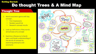
In the design process, we usually begin with mind maps and thought trees to get our ideas. Once we have finished our mental exploration, it is important to visually explore our ideas. The initial visual explorations are called thumbnails or thumbnail drawings.


Thumbnail drawings are quick gestural sketches that are meant to get our ideas on paper. These usually are imperfect, hastily drawn images taking no longer than 5 minutes that allow the artists to quickly see how their ideas are forming. Thumbnails sketches also inform the artist on what exactly they need to research for their final product.


The difference between a tight sketch and a thumbnail is that tight sketches can take up to an hour or even longer. At this point, the artist should have amazing reference that they are testing out. The composition of the piece should have been already decided based upon the thumbnail work. 

After a tight sketch you can explore colors.


So, all the elements of design are pretty much decided, what is important is to see what the components are going to look like together. Even more important, the artist is going to test the value. Without testing the light sources the final blueprint for the final image will be for nothing. No amount of color will save bad value. The tight sketch is the key to a successful final image.


Tuesday, March 7, 2017

Kaiju Jumpstart!


Create a larger than life creature that would be amazing for a movie. You may re-interpret a monster that already exists, develop a character based off of mythology or design your own monster Kaiju! 


This is due March 9th.

Flight Checklist!


Flying is one of the safest modes of transportation. So as artists we can learn from the success of the airline industry of how we can take our product from where it starts to how it gets to its destination. 


Review the checklist below to make more successful art!


Tuesday, February 21, 2017

Robert Ebb Jumpstart!


We watched this... You may want to watch it again...again..again..(you get the idea.)


You are to create a 5" by 7" tight value sketch of a movie poster for this short film. This will be critiqued and will be due Monday, February 27th.


Remember Mind Maps may help you with this project.


Thought trees and mind mapping can overcome being stuck.


Rubric For Grading this Project:

1. You follow the principles of design as listed on your Syllabus with a keen focus on the following areas:

  • Gesture
  • Value
  • Compositional Storytelling
  • Design Hierarchies
  • Good use of Reference

2. You final product is 5" by 7" and have a border

3. Image must contain a symbols or representational images that reflect the story of
    The Elaborate End of Robert Ebb.

Remember the best work will be shared with the actual movie directors!